There’s a lot of feedback flying around in the PR/advertising world.
No press release, key messages doc, social media post or piece of creative is complete without a few tweaks, plus ups, enhanced branding or added sizzle to make it pop.
On one particularly rough day of feedback, I thought to myself, “Goodness gracious. These people would give feedback to the Mona Lisa, a classic work of art!”
Which got me thinking about what creative feedback I would give to the Mona Lisa. I am an account person, after all.

“I feel like this woman could be painted by any artist. How is this Mona ownable to Leonardo Di Vinci?”
Hmmm, that was fun and therapeutic. I asked a few of my clever advertising/PR friends to take a break from their billable work and join in this classic art feedback exercise with me.
Now that we’re grounded in the background, here’s what they came up with:
David – Group Manager

Salvador Dali – The Persistence Of Memory:
“I think the creative is compelling but why did you decide to feature those times on the clocks? Will consumers notice that those aren’t our store hours?”
/////////////////////////////////////////
Tricia – Digital Director

Da Vinci – The Last Supper:
“We need to make sure we’re covering off on diversity. How is this reflective of all of our customer segments?”

Paul Cezanne – The Card Players:
“We’ll need to add prominent legal disclaimers or take out the wine bottle, and not imply that these are playing cards as we don’t want to condone gambling.”
/////////////////////////////////////////
Erin – VP

Georges Seurat – A Sunday Afternoon on the Island of La Grande:
“Photo quality is grainy. Please send high-res version.”

Rene Magritte – The Son of Man:
“It’s hard to capture emotion here, with that apple in the way. Maybe we could move it over a bit to the left or the right (will defer to you)?”

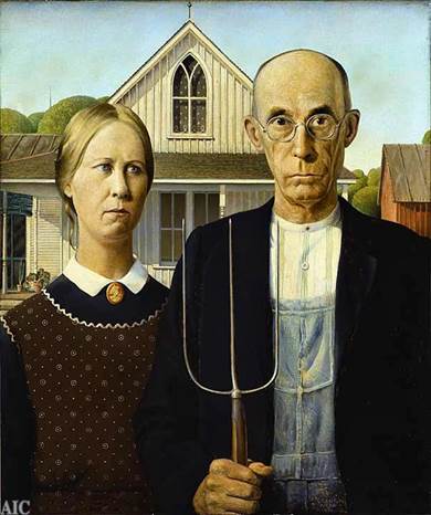
Grant Wood – American Gothic:
“Is that branding I see on her collar pin? Let’s blur it out to be safe. Also, are we worried about implied safety issues regarding the way he’s holding that pitchfork?”
/////////////////////////////////////////
Aubree – Director, Consumer

Van Gogh – Starry Night:
“I’m just not loving the blue…”

Da Vinci – The Last Supper:
“I’m just not sure we really thought this through.”

Michelangelo – The Creation of Adam:
“Feels a little 1495.”

Andy Warhol – Campbell’s Soup Cans:
“Can we add more branding?”
/////////////////////////////////////////
RB – VP

Jackson Pollock – Number 5:
“First of all, I want to take a moment and really thank you for the effort you brought forward in this painting. You can tell that you spent a lot of time and energy into putting this together. Unfortunately, I don’t think this type of work will really resonate with our target audience. Remember, Gen Z’s only have the attention span of about 6 seconds. That’s less than a goldfish! And while, as a Gen Xer, I really like the piece, I don’t think it’s going to grab their attention. I mean. There’s just too much going on! How does this translate into the 360 marketing model? Where’s the in-store component? Out of home? How can I make this into a Snapchat filter? I understand that it’s exactly what I wanted in the brief, but maybe I got the brief wrong.”
/////////////////////////////////////////
Evan – Senior Account Executive

Edvard Munch – The Scream:
“Are we going too negative here?”

Grant Wood – American Gothic:
“I just don’t think this is sexy enough.”

Salvador Dali – The Persistence of Memory:
“These watches look broken.”
/////////////////////////////////////////
Margaux – Senior Digital Associate

Hieronymus Bosch – The Garden of Earthly Delights:
“Instead of three separate panels, could you just combine the parts we like from each section into one painting?”
/////////////////////////////////////////
Too much fun. Let’s close the loop with some final feedback on The David by Michelangelo:

Before we get too far into this, let’s take a step back.
Wait, now that I’ve taken a step back I can’t really see it.
CAN WE MAKE IT BIGGER?
